

How to choose the color of the stretch ceiling?
- Color selection criteria for suspended ceilings
- How to choose the color of the stretch ceiling for different rooms?
- Human exposure to flowers
- Varieties of texture of suspended ceilings
- How to combine the colors of a two-level stretch ceiling?
- Bad options for combining suspended ceilings
- Useful tips when choosing the color of the stretch ceiling:
- Stock footage
Repair is a rather complicated, lengthy and tedious task. At the stage of preparatory work, there are few difficulties, which can not be said about the finishing work or the decoration of the room. One of the main stages of room design is the choice of color and texture of the stretch ceiling. The shade that you choose should become the backdrop for the rest of the items located in the room, and emphasize the uniqueness of the design. How to choose the color of the stretch ceiling to create a cozy atmosphere in the room and visually transform the room? We will talk about everything in detail in our article.
to contents ↑Color selection criteria for suspended ceilings
Previously, special attention was not paid to the choice of ceiling color; it was “automatically” painted in matt white with paint or whitewash. With the advent of stretch webs, the possibilities have expanded significantly. Manufacturers of ceiling fabrics offer a wide range of colors, patterns and textures. Sometimes it is even difficult for a professional designer to make a choice in favor of this or that material.
To correctly combine the color of the suspended surface, it is worth paying attention to some important criteria by which you can easily determine the right material. Before you buy your favorite shade of a stretch ceiling, consider not only your personal preferences, but also the features of the room where you want to install it.
Room height
For rooms with low ceilings, cold shades are more suitable. They will visually increase the height of the room. In turn, warm tones - on the contrary, reduce its height.
Important! The more saturated the color of the suspended surface, the lower the ceiling in the room will seem.
Room size
Installing a stretch ceiling can increase or decrease the height of the room. It depends on the color saturation of the material and its hue:
- In rooms that are small in size, surface finish in traditional white or light beige colors.
- Oversized rooms allow you to decorate the surface in almost any color scheme, so connect your imagination and create.
Important! When choosing a particular shade of the canvas, make sure that it harmoniously blends with wallpaper or other interior items.
Lighting:
- The best option for a room with low light penetration is to install a stretch ceiling in bright warm colors.
- In the case of a sunny and bright room, build on personal preferences and other characteristics.
Room Assignment
Each color has its effect on a person: some are able to invigorate, others - to relax, and others - cause appetite. Based on this, for each room there is a special palette of shades that is most suitable for a particular case:
- Cold invigorating shades, for example, blue or gray, will fit most harmoniously into the bathroom.
- It is recommended to install a calm, warm shade ceiling in the bedroom.
How to choose the color of the stretch ceiling for different rooms?
The style of decoration plays a very important role in choosing a stretch ceiling. But do not forget that for each type of room the color scheme is slightly different. In order to have a pleasant rest in the house after a hard working day, or, conversely, to have fun meeting guests and spending time, it is necessary to use different color combinations. Next, we will consider in more detail how to choose the color of the ceiling to the wallpaper for rooms for various purposes.
Hallway and corridor
The overall impression of the apartment is formed as soon as a person crosses the threshold of your home. Therefore, the entrance hall is the visiting card of the entire apartment. If you decide to trim the ceiling with a stretch fabric, consider the following:
- Hallways usually do not have windows. Therefore, it is recommended to use light shades for the decor of the ceiling.
- Chocolate and cream glossy fabrics will be an ideal color combination for installing a stretch ceiling.
- There is one simple rule when installing furniture or decorating walls in the corridor: dark colors should occupy a smaller part of the room.
Important! Furniture for small halls should be several tones lighter than the ceiling.
Living room
The room is designed for a noisy feast, birthday parties and meetings with friends, so here you can embody any design idea.
In the large spacious living room, you can install a multi-colored multi-level ceiling or use translucent material and install hidden lights.
Cabinet:
- The working area should not be allocated too bright and defiant color. For productive brain function and maximum concentration, use plain, calm shades of green or blue.
- The texture of the paintings choose matte or satin, you can also apply a material that imitates the tone of the metal.
Bedroom:
- This type of room is designed for relaxation or sleep, so calm and warm tones should prevail in it to finish the surface: yellow, cream, caramel, peach, coffee.
- If you combine several colors, highlight a sleeping area or dressing table, then for such cases, blue or light green are perfect.
Important! To complete the bedroom look, select the color of the wallpaper or the color of the stretch fabric so that they overlap. In the case when the shades are the same, visually the room will appear lower.
Children's:
- You should not use bright and colorful shades to decorate a child’s room. They will not allow the youngest member of the family to concentrate on watching cartoons or reading a book.
- Use delicate neutral colors such as white, blue, green, pink or yellow.
- The starry sky or sea waves do not distract attention, on the contrary - they allow you to think and focus.
Important! You should not decorate the ceiling space with paintings depicting cartoon or movie characters. Children grow up very quickly and change their tastes, a previously beloved hero may lose their temper over time.
Kitchen:
- The kitchen is the place where a woman spends a lot of time, so in this room a combination of several colors or one, but a bright shade, is perfect.
- For kitchen ceilings, use colors that evoke appetite, such as rich red, bright orange, or green.
Important! To create completeness in the room, select several items that match the color of the ceiling. It can be chairs, bedside tables or decorative elements.
Bathroom:
As a rule, in a bathroom a person gains energy, or wants to cheer up after sleep and hot weather. Therefore, in this room it is inappropriate to use relaxing gentle tones, on the contrary - cold shades of blue, gray, green or indigo will be better.
to contents ↑Human exposure to flowers
Each color has a different effect on the human body, causes certain emotions and creates a mood. Therefore, before choosing the color of the stretch ceiling to the wallpaper, carefully read the basic characteristics of the colors.
White
The white color of the ceiling belongs to the class of the classic and neutral versions. This shade restores calmness and has a relaxing effect on a person.
The best option for indoor installation is a combination of white with black.
Important! If you decide to install a white suspended ceiling, highlight the walls in bright color. However, do not get too carried away with this color, the oversaturation of white causes apathy and boredom.
The black:
- Universal color, suitable for combination with different shades.
- On the surface it looks stylish and aristocratic.
- The best place to install the black combination ceiling is the living room.
Important! The predominance of black on the surface will create an exclusive thematic design.
Blue or blue:
- Great for sunny spacious rooms.
- Favorably affects the human body, leads to peace and tranquility.
- When installed in a nursery or office, it contributes to reflection and decision-making.
Lilac:
- The color is heavy enough for perception, although it has a calming property.
- The most used area for lilac color is a corridor or a living room.
- When installed in a bedroom or nursery, it can cause bouts of depression.
Chocolate:
- Noble color, perfect for installation in the office or for the design of the working area for the child.
- Combined with warm colors and gives a person a feeling of reliability in the room.
Gray:
- False gray ceiling will give owners a sense of stability and confidence.
- Complement the simple and classic setting.
Orange:
- A wonderful invigorating and cheerful shade, causes appetite and fun.
- A dimly lit room is the best option for installing a sunny orange canvas.
- Also often used orange suspended ceiling in the decoration of the nursery, kitchen and dining room.
Yellow:
- Positively affects the human psyche.
- Installation of the canvas in the nursery will contribute to concentration and calm.
- When finishing a work area or study, it will fill the room with light and cause a feeling of warmth.
Red:
- Passionate, dynamic and fiery color.
- Causes sexual activity and increases appetite.
- Ideal for stretch ceilings in the living room, dining room or kitchen.
Important! It is highly undesirable to use red canvases when decorating bedrooms, nurseries, as long-term stay in the room color causes aggression and irritation.
Green:
- Calm, pacifying shade, charitable effect on the human psyche.
- If you choose the green color of the stretch ceiling, it will create a sense of harmony and joy in the room.
- Mostly green ceilings are installed in large rooms.
- Also suitable for use in the bedroom, as it improves sleep.
Pink:
- Neutral universal color suitable for installation in a room for any purpose.
- It causes a person tenderness and romantic feelings.
- Fairly feminine hue, fresh and original.
to contents ↑Important! When installing a dark or bright stretch ceiling, it is important to create sufficient lighting in the room.
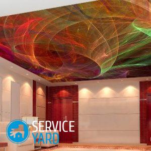
Varieties of texture of suspended ceilings
As it may seem at first glance, there is nothing complicated in this choice. However, the wrong combination of color with the texture of the material can fundamentally change the result of repairs in the room. Therefore, you should definitely pay attention to the following nuances.
Matte finish:
- A surface with such a coating will visually reduce the perimeter of your room.
- In most cases, matte canvas is used for printing, so the printed pattern on the ceiling is not distorted.
- Painted matte ceilings of a gentle light shade do not irritate the eyes and soothingly affect a person.
Satin Ceiling:
- The material most harmoniously and beautifully looks in a large room.
- Iridescent mother-of-pearl shine will give the room a sophisticated and expensive look.
Important! The surface of satin material is able to scatter light, so the room should have adequate lighting.
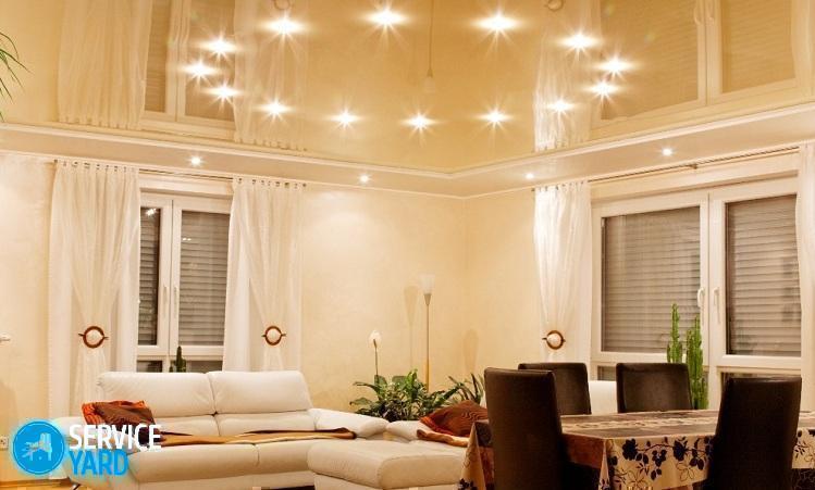
Glossy stretch ceiling
Due to its mirror properties, it significantly increases the size of the room, and also visually expands the space. When finishing the ceiling with glossy material, the lighting in the room increases, since the light is reflected from the mirror surface.
Suede fabric:
- The material most harmoniously and comfortably looks when decorating bedrooms.
- The canvas completely absorbs light, so there should be a sufficient amount of it in the room.
Important! Do not use suede fabric of dark shades, the surface will become heavier, there is a feeling of confined space.
Texture surface:
- The ceiling with imitation of stone, metal or wood will create comfort in the room and visually expand it.
- It is appropriate to install such material in the bathroom, kitchen or hallway, as well as in small compact rooms.
Important! To harmoniously create a decor of a large space, combine such a canvas with a plain material.
Translucent ceiling
As a rule, such fabrics are used in places with hidden lighting. In this case, use a plain cloth.
to contents ↑How to combine the colors of a two-level stretch ceiling?
When installing a monophonic ceiling, there are few problems. You can determine the right color fast enough. All that needs to be done is just to choose a canvas that resonates with interior details or wallpaper. A completely different case when it comes to color matching for two-level ceilings. Fabrics need not only to match the design of the room, but also to combine colors with each other.
Here are some practical tips on this:
- Combining the same color with different tones on the surface is a win-win. For example, a combination of green and light green, blue and dark blue.
- Red, orange colors combine with white, black and gray, as well as yellow shades.
- In the case of installation of paintings with a pattern harmoniously complement the green ceiling depicted yellow, light brown and orange drawings.
- The yellow canvas will be transformed with painted blue, light green, brown and green patterns.
- Beige color blends nicely with white and yellow.
- Blue pendant canvas complement turquoise, pink, gray, purple and burgundy tones.
- The black-and-white ceiling will stylishly and effectively complement the interior with installed red elements.
Bad options for combining suspended ceilings
Sometimes the landlord really wants to combine incongruous colors. At first glance, this seems like a good idea, but later, when you get used to the new repair, such a ceiling can bring disharmony into the whole interior and spoil all your efforts.
So, what colors are better not to combine on your ceiling?
- Blue and red.
- Yellow and pink.
- Dark green and burgundy.
- Brown and purple.
After reading our recommendations on combining shades, you will be able to choose the color gamut of materials as competently as possible without resorting to the expensive help of designers.
to contents ↑Useful tips when choosing the color of the stretch ceiling:
- Do not draw up the walls and ceiling in one tone.
- When combining several colors, it is important to combine not only color but also tone. The same tones of different colors can muffle each other.
- The most successful option in the design of the ceiling is the use of monochrome combination.Properly selected gray and beige colors effectively complement the room with proper lighting.
- As a rule, the tension surface serves as a background for other elements of the decor.
- The ceiling and walls should be in contrasting colors. Dark ceiling - light walls, and vice versa.
- When combining several shades, do not overdo it by combining three or more shades. For the right combination, use two tones.
- The stripes along the room visually make it longer.
- Visually, the room will become wider when applied transverse color patterns on the canvas.
- The pattern on the canvas, located diagonally, will increase the space.
Stock footage
As it turned out, such a simple question of how to choose the color of the stretch ceiling requires a thorough consideration, because there are many nuances, and they should be taken into account so that the room looks cozy and harmonious. Correctly, tastefully selected shades will emphasize the individuality of your interior and design style, and in addition will create a certain mood in the room. Using the useful information from the article, you will avoid many errors and will be able to achieve the desired result.
- How to choose a vacuum cleaner taking into account the characteristics of the house and coatings?
- What to look for when choosing a water delivery
- How to quickly create comfort at home - tips for housewives
- How to choose the perfect TV - useful tips
- What to look for when choosing blinds
- What should be running shoes?
- What useful things can you buy in a hardware store
- Iphone 11 pro max review
- Than iPhone is better than Android smartphones
 (No ratings yet)